
一、简单介绍
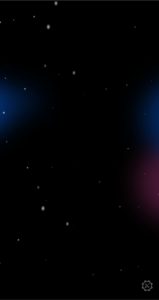
这份星空背景效果依托CSS实现,不依赖任何第三方JS插件。
整体全屏固定在页面底层,不会遮挡页面正常内容展示,通用性很强。
二、代码来源
效果原型取自GitHub官网注册页面背景动画。
三、使用方式
1.下载下方的压缩包并复制其中的”preview.gif”和”hero-glow.svg”到你的项目中。
2.粘贴下方的css代码到你的css文件,或使用style标签引入。
3.粘贴下方的html代码到body标签的底部。
4.如不需要光晕可以删除
<img src=”hero-glow.svg” alt=”星空发光效果” data-nopindex class=”star-glow”>
这一行代码。
代码及资源:
下载css:
/* GitHub注册页同款星空背景 */
body {
background: black;
}

.bg-container {
position: fixed;
top: 0;
left: 0;
width: 100vw;
height: 100vh;
z-index: -1;
overflow: hidden;
}


.signup-space {
position: absolute;
top: 0;
right: 0;
bottom: 0;
left: 0;
overflow: hidden;
z-index: 1;
}

.signup-stars {
position: absolute;
top: 0;
right: 0;
bottom: 0;
left: 0;
overflow: hidden;
background-image:
radial-gradient(2px 2px at 50px 200px, #eee, rgba(0, 0, 0, 0)),
radial-gradient(2px 2px at 40px 70px, #fff, rgba(0, 0, 0, 0)),
radial-gradient(3px 4px at 120px 40px, #ddd, rgba(0, 0, 0, 0));
background-repeat: repeat;
background-size: 250px 250px;
opacity: 0;
animation: zoom 10s infinite;
}

.signup-stars:nth-child(1) {
background-position: 10% 90%;
animation-delay: 0s;
}


.signup-stars:nth-child(2) {
background-position: 20% 50%;
background-size: 270px 500px;
animation-delay: 0.3s;
}


.signup-stars:nth-child(3) {
background-position: 40% -80%;
animation-delay: 1.2s;
}


.signup-stars:nth-child(4) {
background-position: -20% -30%;
transform: rotate(60deg);
animation-delay: 2.5s;
}

.signup-stars:nth-child(5) {
background-image:
radial-gradient(2px 2px at 10px 100px, #eee, rgba(0, 0, 0, 0)),
radial-gradient(2px 2px at 20px 10px, #fff, rgba(0, 0, 0, 0)),
radial-gradient(3px 4px at 150px 40px, #ddd, rgba(0, 0, 0, 0));
background-position: 80% 30%;
animation-delay: 4s;
}

.signup-stars:nth-child(6) {
background-position: 50% 20%;
animation-delay: 6s;
}


@keyframes zoom {
0% {
opacity: 0;
transform: scale(0.5) rotate(5deg);
animation-timing-function: ease-in;
}

85% {
opacity: 1;
}

100% {
opacity: 0.2;
transform: scale(2.2);
}
}


.star-glow {
position: absolute;
top: 50%;
left: 50%;
width: 200%;
transform: translate(-50%, -50%);
overflow: hidden;
pointer-events: none;
z-index: 0;
}


@media (prefers-reduced-motion) {
.signup-stars {
animation: none;
}
}
html:
<!– 星空背景容器 –>
<div class=”bg-container”>
<div class=”signup-space”>
<div class=”signup-stars”></div>
<div class=”signup-stars”></div>
<div class=”signup-stars”></div>
<div class=”signup-stars”></div>
<div class=”signup-stars”></div>
<div class=”signup-stars”></div>
</div>
<img src=”./hero-glow.svg” alt=”星空发光效果” data-nopindex class=”star-glow”>
</div>
整体轻量化,加载无压力,适配移动端和电脑端,适合用作个人主页、博客首页背景。
评论(0)
暂无评论